This week: sentiment and speculation, strategist sprint, gold vs stocks, commodities vs bonds, US vs Europe, earnings trends, valuation extremes, and the doubt-vs-hype cycle in fund flows.
Learnings and conclusions from this week’s charts:
-
Seeing more and more signs of stretched sentiment.
-
The Gold vs Stocks ratio may be nearing a turning point.
-
Commodities vs Bonds hold key clues on the macro outlook.
-
US stocks have exponentially dominated vs European stocks.
-
US stockmarket valuations reflect supreme confidence.
Overall , it seems like a case of another week, another set of charts showing more and more signs of overhyped sentiment, exponential expectations, and richly priced markets. The trouble is if you want to be bearish the kinds of dynamics in play here can easily leave you behind, but you don’t want to be blindly bullish either because when expectations are running this high it won’t take much to disappoint; and there are lot of bullish minds that could quickly change.
1. WallStreetBets Betting Back Bigger:
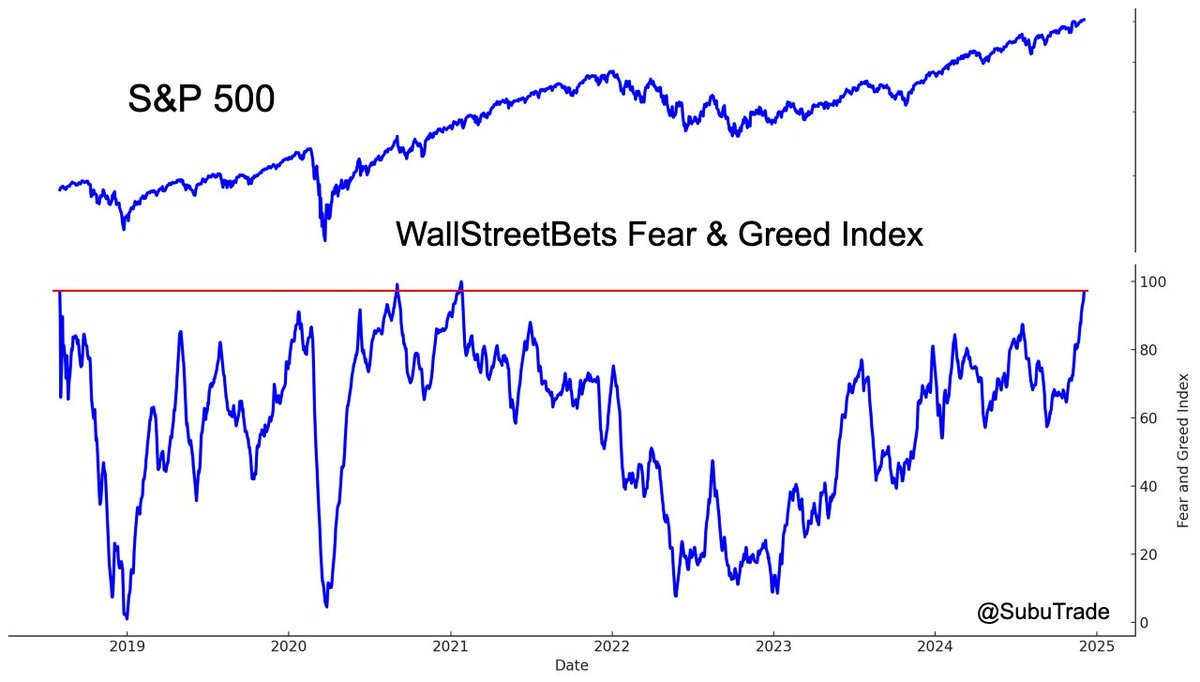
After a long road to recovery, sentiment among the Reddit WallStreetBets community has reached levels last seen during 2020/21 when a stimulus-fueled frenzy took hold over markets (recall: massive rate cuts, QE, fiscal stimulus, payment of stimmy checks into bank accounts). It’s interesting that sentiment has become so frothy now but without the same kind of pace, breadth, and magnitude of stimulus as back then.
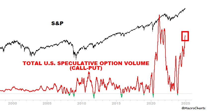
2. Speculative Extremes: Another angle on it, this time looking at speculative options market activity — after being crushed by the brief bear market of 2022, nature has recovered once again.
Is this the establishment of a new normal higher generalized level of speculation? Or is this a sign that bullish speculation is overcooked?
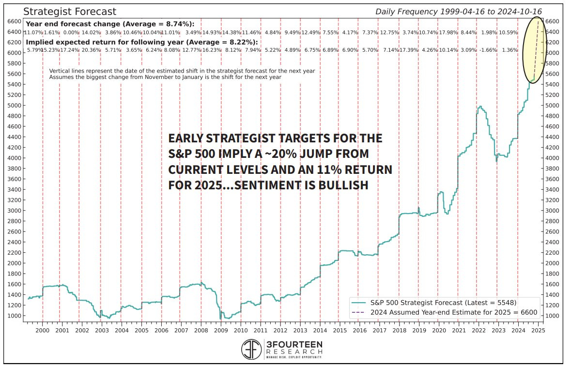
3. Sprightly Strategists: Another data point on the sentiment front is the bullish S&P 500 targets by strategists for next year: “Wall Street strategists spent 2024 with targets well below the S&P 500. Next year, though, strategists are poised to lift their 2025 targets by 20% (vs 2024 marks) and 11% above the spot S&P 500 ([consensus targeting] ~6,700). This is the largest surge in strategist optimism on record.”
These are all just further data points that highlight what I have previously documented about how high expectations are heading into 2025.
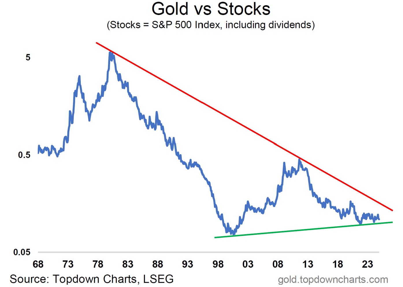
4. Gold-Stock Symmetry: One chart from my new Gold Market Chartbook I wanted to highlight is the long-term gold vs stocks relative performance chart. First, it should be noted that we are looking at the US$ gold price vs the S&P 500 in total return terms (with the ratio displayed on a log scale).
What’s striking about this chart is the following: 1. the clear lines in the sand (larger long-term 40-year downtrend line vs the newer 20-year uptrend line) —and the associated large-scale triangle pattern emerging; 2. the symmetry in the bull vs bear markets of the past 2 decades (with the implication being that the relative bear market is likely over); and 3. the more recent notching up of a higher low.
Given what we know about how extended and frothy the stock market is right now, and the promising signs in the technicals here, I would say it would be wise to be on watch for a turn-up and breakout in this chart (which by the way is all the more meaningful given it is a monthly chart and is unfolding over a larger scale than what most people are focused on at the minute).
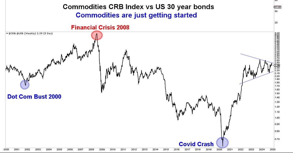
5. Commodities vs Bonds: This one is equally fascinating, with clearly interesting technicals, but even more interesting macro + asset allocation implications. The chart is showing commodities vs bonds relative performance. From a macro standpoint I would argue up-moves in this chart are reflationary (growth/inflation up = bullish for commodities, bearish for bonds), while down-moves are deflationary (growth/inflation down = bearish for commodities, bullish for bonds).
On my metrics, both bonds and commodities are showing up as cheap, and they are each tied to the big macro tails of recession risk on the one hand (bonds) vs inflation resurgence risk on the other (commodities). The technicals tell the tale of how for now the macro picture is one of policy perfection where neither rapid growth nor recessionary conditions are taking hold, it’s a range trade, and a range-trade into a triangle (tightening range) no-less; and resolution likely comes soon.
Long-story short, pay attention to the next step in this chart because it will tell you what macro tail is the incoming reality (recession down vs resurgence up).
6. The Exponential Domination of Europe:
Switching gears, this chart shows US vs European equities relative performance. The dominance of European equities by their US counterparts is stark and absolute. I’ve commented elsewhere that with regards to the rolling crises in Europe post-08, Europe lost and America won (the European debt woes allowed the Fed to run easier for longer policy, and catalyzed a flow of talent, capital, and market share to US corporations). This chart shows that point of demarcation, which in many ways enabled a procession of wins by the US tech-stock-industrial-complex.
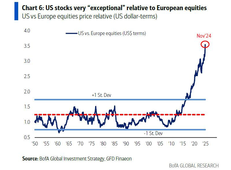
7. Exponential Domination Exhibit 2: The previous chart is no secret, and has been reflected into valuation levels. US Stocks are priced for perfection, European stocks are priced for imperfection. Realistically if we wanted to look for a turn in either this or the above chart, I think the greater likelihood would be for US stocks to undershoot these increasingly very high expectations vs for Europe to overshoot vs very low expectations. But the key point is the extremes in price are also showing up as extremes in valuations.
Original Post

